Publishers’ profitability plans: the need for a website redesign
We’re sure that noticed that most sites are in a constant search of an optimal interface and user experience to increase ads revenues. Content presentation, visual effects, design itself, informational structure, those things should be perfect for users or at least on its way to perfect.
Let’s try to summarize some advices:
Visual elements
- We’ll start with the obvious one: Your design should be responsive. Users should get as similar experience as possible while visiting the same portal using different devices. This is the reason why many publishers are using cross-platform frontend frameworks. Mobile media consumption is one of the biggest trends for last years. Recently Washington Post launched it’s own solution to deliver mobile ads called Fuse.
- You can experiment with visual elements, if you’re not a fan of pattern’s use, but there’s no doubt that widespread of some elements use makes the function easily recognizable for users. We’re talking about hamburger menu. If it’s good enough for The Guardian, NYT (learn more about New York Times best practices) and Times, it can work for you too.
- Fonts. We can talk about them forever. How important can be the font for the publisher, the selection of the one, can last for a while. And that’s so great if you decide to go further than Core Fonts for the Web, but make sure that its displays the same way on all OS.
- Work with photos or pictures can be tricky. They can have different format, quality, plot and it’s making us think about ways how to put them next to each other. Card Layouts an answer to this problem, but it isn’t a new solution though. It was pioneered by Pinterest, cards now are everywhere on the web, they can present information in perfect for scanning mode. Content containers’ shape makes them easier to re-arrange for different device breakpoints, which is extremely convenient.
If we’re talking about an enormous stream of information, that is different by its content, style and format (and if we’re living on Earth in 2016, we’re probably are), we should consider ways to find a balance and to combine something that can’t be combined at a first sight.

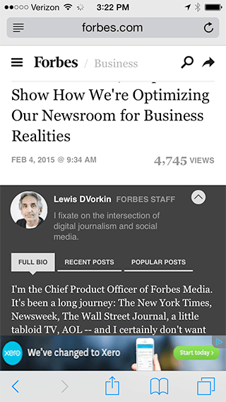
Lewis DVorkin from Forbes says that in new site design Ads are placed, arranged and progressively loaded to achieve less page clutter and maximum ad viewability. The visitor wins as fewer ads are bunched together (in most cases, only one per screen). The marketer’s ads only appear as consumers scroll down a screen, meaning they’re far more likely to be seen and clicked on. A modified continuous scroll that delivers trending headlines rather than posts, a move that provides for a better mobile scanning experience and also makes ads more viewable.
Structure
- The structure is one of the main things to retain readers on your resource. Thus interface designs should on the first place when developing structure and visual part design should base on it. Ad viewability also improves through good design principles: a clear visual hierarchy, symmetry and pleasing proportions, white space and clean design.
- Always track analytics and metrics, usability testing and eye tracking. You can start your redesign from insight that you’ll get from that data.
- You shouldn’t probably shock your readers by the immediate change of every aspect of your resource. Do it gently, you want to gain new reader, but to keep regular readers as well.
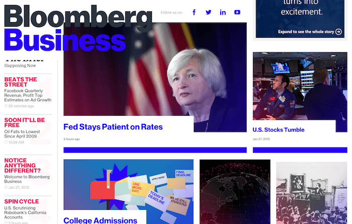
To keep the many images, boxes, side rails, section headers, and grids of the homepage in order, Topolsky says Bloomberg engineers built a special authorship platform that gives producers flexibility, as well as the ability to lock ads to improve viewability. “It seems like a daunting amount of work, but it’s not, because of the power of the tools we have,” Topolsky says.
Content itself
- A good practice is to divide text with video, audio and other details and short articles that are easily shareable to blogs. NYT and The Verge are great examples for that. However, many of top publishers are trying to find a best way of content serving by experiments and observing feedbacks.
- It is never too late to add more interaction in your content. Today storytelling is transforming into virtual reality and you can participate in this process as well. We mean, yes if you have high-quality material, no one can take it away. You can leave as a header and a text itself and the article will still can have value. But in all other appropriate cases, you can add an entertaining component. You have them plenty to choose: Background, loading, motion and hover animations, slideshows, image compare tool (it’s when you have two pictures in one, you can compare them moving bar from side to side).
- Perfect layout. It was “must” for prints and still is for web. Great typography, big illustrations, quotes, charts. Same old, same old. The thing that you don’t want to forget though is your uniqueness and own standards. Reader chose you for a reason, be consistent and stick to your style.
Wired recently introduced a major redesign of its website, and while the impetus for its redesign wasn’t too allay advertisers’ viewability concerns, viewability was “a big priority for us and integral to the whole philosophy of the redesign,” according to Kim Kelleher, Wired’s publisher. A 300-by-600 display ad on Wired’s article pages, for instance, remain anchored in place as readers scroll down an article to ensure it remains in view.
Technical miracles
- Creating designed patterned blocks that you can implement via CMS and use as a constructor, which operates with predefined parts, can gain a huge amount of benefits. Today we often have a problem when the creation of a longread with lots of visual elements is almost like creation of separate landing page with a whole team of developers and designers. All of the options should be included in CMS, thus you’ll require only two people for one material – the one who wrote it and the one who post it.
- Improve page speed. Sites that are laden with ads can typically take a long time to load, which can result in a lower ad viewability as users click away before the ads load. Techniques for speeding up ad delivery can greatly improve ad viewability.
- Using A/B testing of ad zones for viewability. The average tested viewability rate you are seeing across your sites and across campaigns should guide you how to place it. Top zones are the most viewable, left-placed ads have the highest CTR. To learn more take a look at Moat research.
- Sticky ad units are a type of ad that remains locked in a specific location when the user scrolls. By equipping the latest Time.com and Fortune redesigns with an infinite scrolling feature, the sites can pursue what Time Inc. group publisher Jed Hartman calls the “predictable viewability” model. By serving readers ads in article feeds as they scroll, Time Inc. both boosts the number of impressions they serve and the overall viewability of those impressions.
According to a AdMonsters report, 74% of the 50 major publishers they surveyed had completed viewability vendor testing. Of that group, 46% have already made adjustments to improve viewability, such as repositioning ads, removing ads, and implementing “Just-in-Time” ad serving to reduce load time.
Instead of seeing viewability as a nightmare and threat to current revenue, publishers shouldn’t lose sight of the big picture opportunity. There you go. Perfect portal.


